While I’ve done quite a bit of digital painting in recent times, my acrylics had been patiently waiting for me to give them the time of the day. Not because I don’t enjoy using them, but there’s more friction to get going and when the end result is primarily shown on a screen anyway, it’s easy to reach for the stylus in front of me over setting up an easel, brushes and a palette. About a week ago however, their moment had come. A friend from overseas told me about his upcoming visit to Vienna and we made plans to meet up. In immediate need of a physical present, digital was out the window. Even if I wanted to go that route, there wouldn’t have been enough time to get anything printed properly. You could hear the tubes of acrylics emitting joyful cheers.
Regardless, my long absence from traditional painting and the fact that it’s more involved made me decide to do a relatively quick, preliminary digital version of the painting anyway. It might appear redundant, but ensured I was familiar with any difficulties and peculiarities of the subject as well as establish a composition. That way I’d be free to focus on mixing colours and getting the look right, instead of still figuring it out.
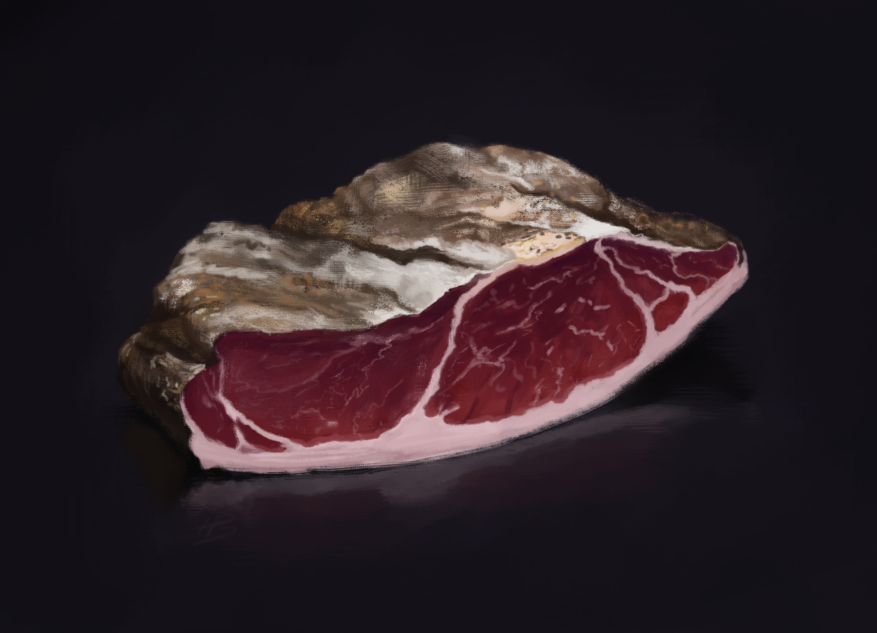
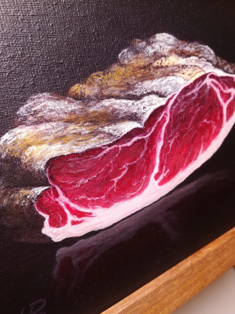
The subject as you can see above was a piece of ham. More specifically Tyrolean Speck. My friend loves cured meats, so I chose something he adores, but would also remind him of the visit to Austria. One thing the study made me aware of was that the challenge lies not in the cut portion of the ham, but the outside of it. The high frequency of surface detail mixed with the variation in colours makes it hard to convey lit forms while also staying true to the textured and chaotic feel of it. Richer in such knowledge, it was time to lay down some coloured goop.
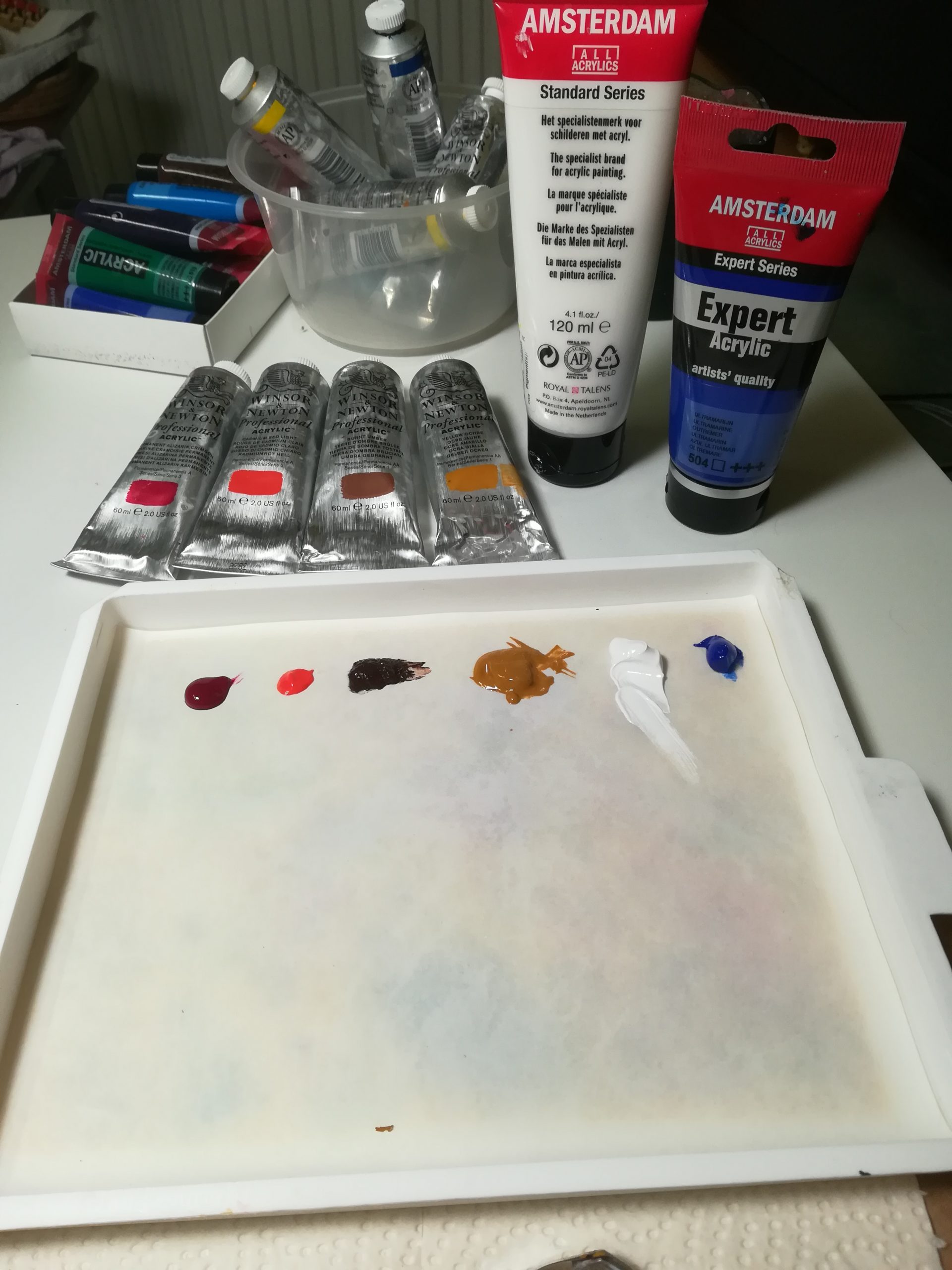
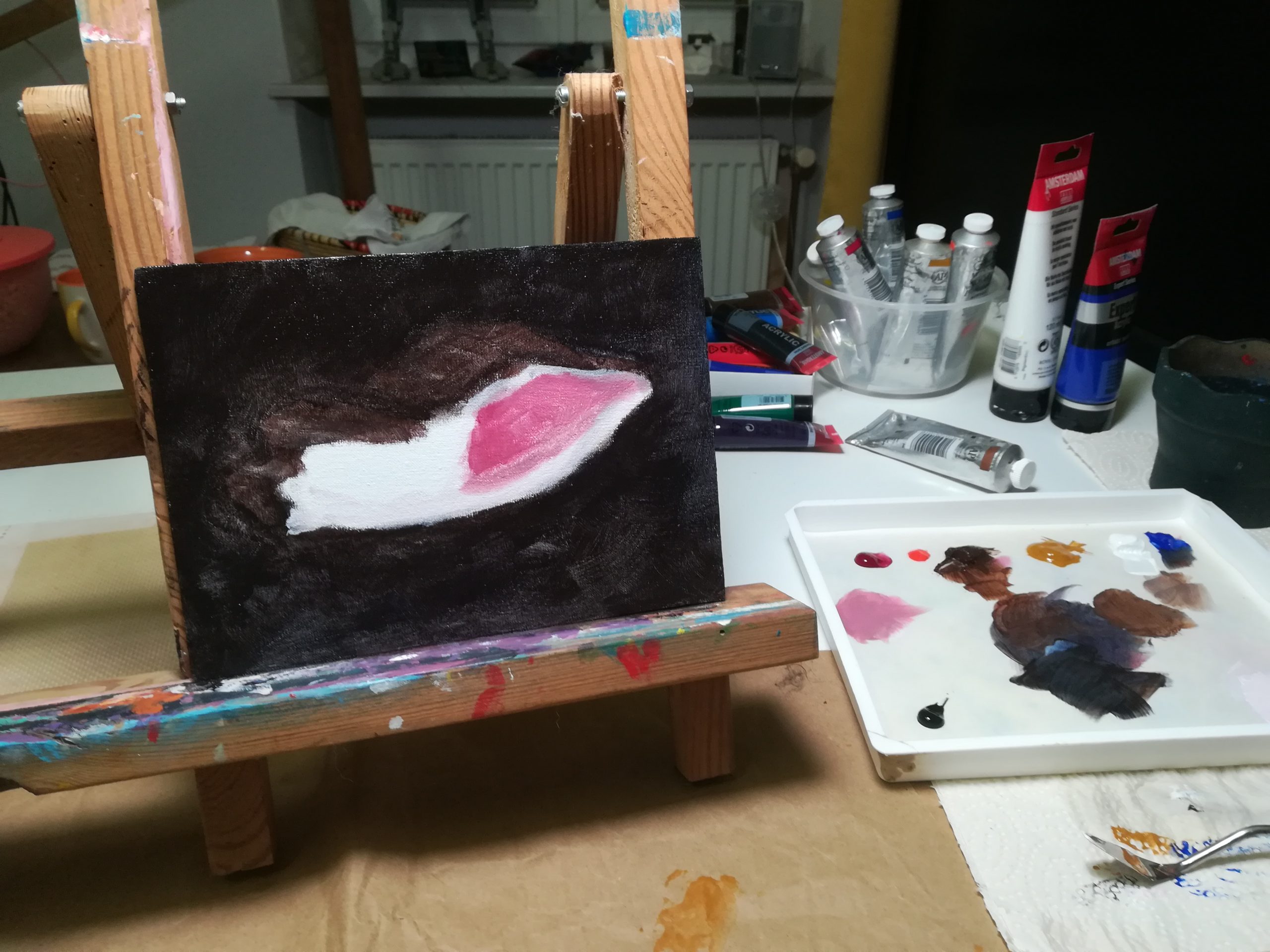
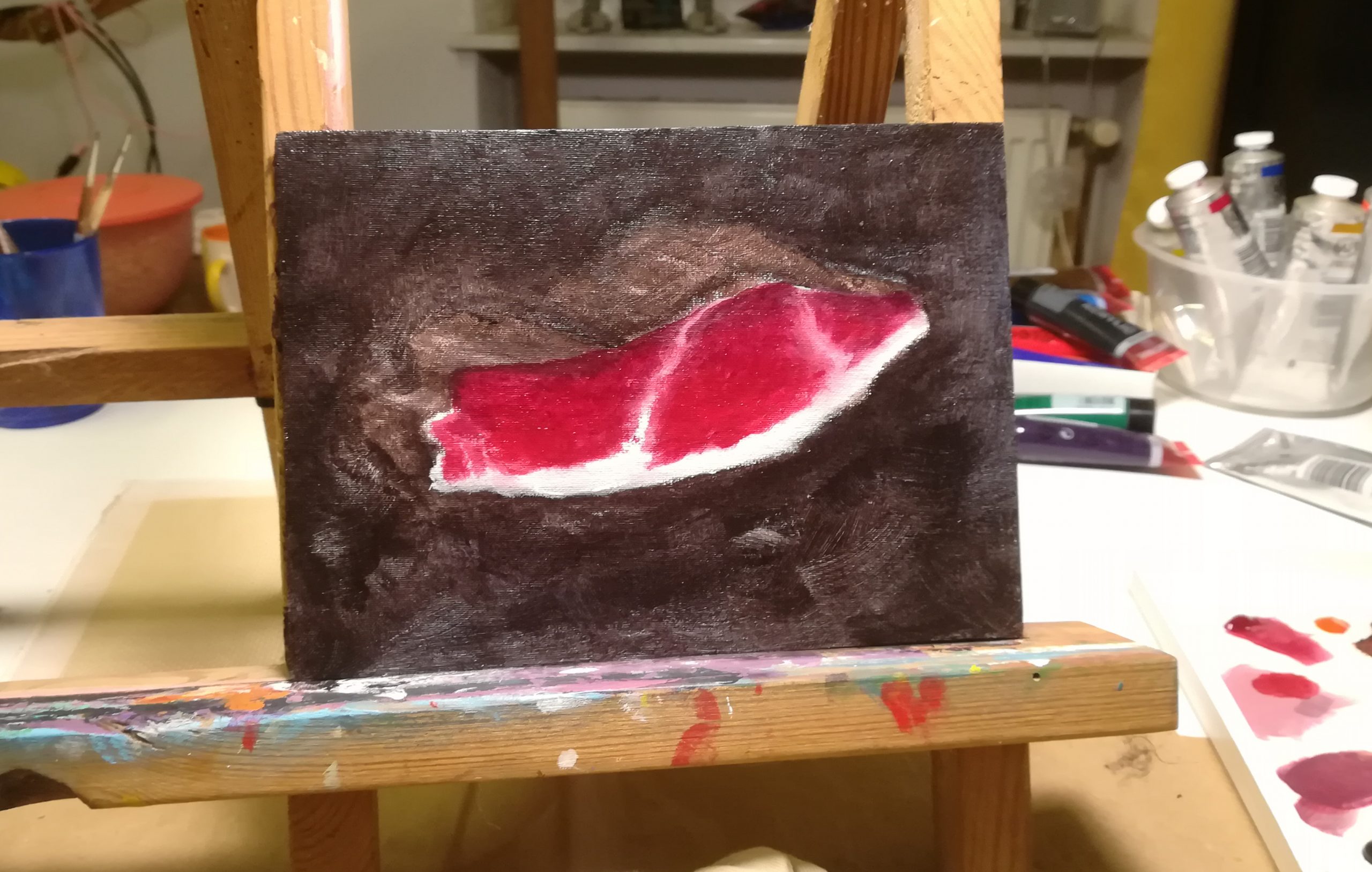
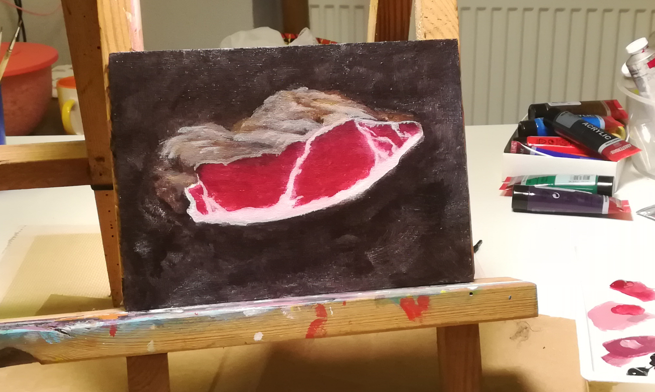
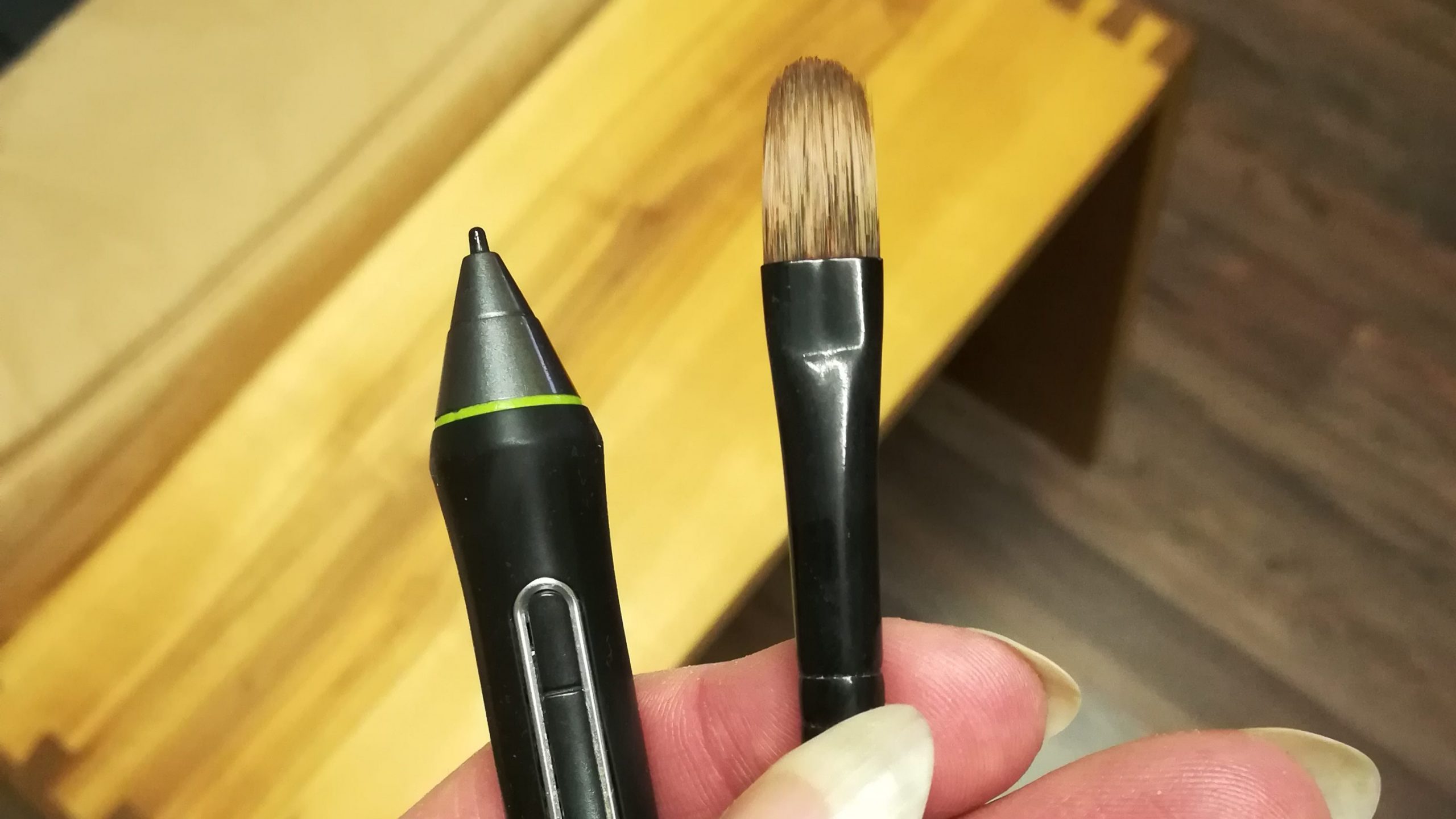
Roughing in all the parts drove home just how much more natural and tactile it is to use an actual brush in different ways compared to a digital one. Sure my tablet has tilt detection & pressure sensitivity and some virtual brushes take it all into account to let you control their orientation, size and opacity, but ultimately it’s still a simplified emulation. Make no mistake, this isn’t about which is better. I dearly love my graphics tablet and using it, but there is a world of difference in feel and how they handle between a plastic tip on a plastic surface and myriad flexible bristles on canvas. The latter lets you pull strokes or dab, with varying pressures, loaded with paint or almost dry, in any combinations, each for a different effect and feedback to it.
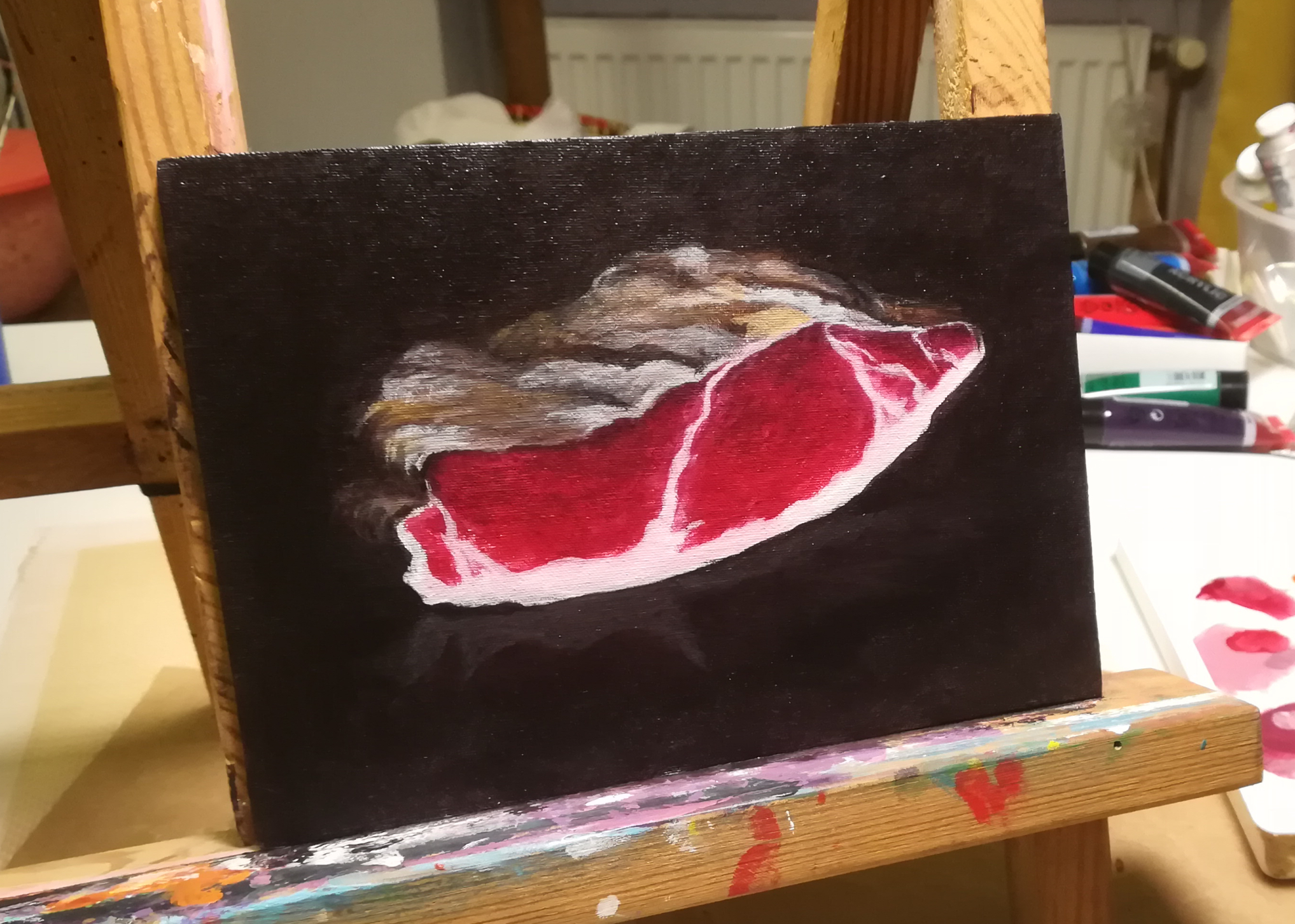
Especially in the case of the ham’s outside, another benefit of the traditional approach revealed itself. The combination of bristly brush strokes and cotton canvas made it almost effortless to quickly establish the rough base texture I was after.
All that said, one of the most important differences between traditional and digital art is not one of input, but perception. We’re so used to it nowadays, but viewing an image on a brightly glowing screen is far removed from looking at paint on a canvas. Even lit by a proper lamp your “full white” isn’t going to be as light as it appears on a monitor and your highly saturated colours from that photo on your phone will not be quite as intense either. A point to keep very aware of when painting traditionally while your reference is contained in one of those electronic rectangles.
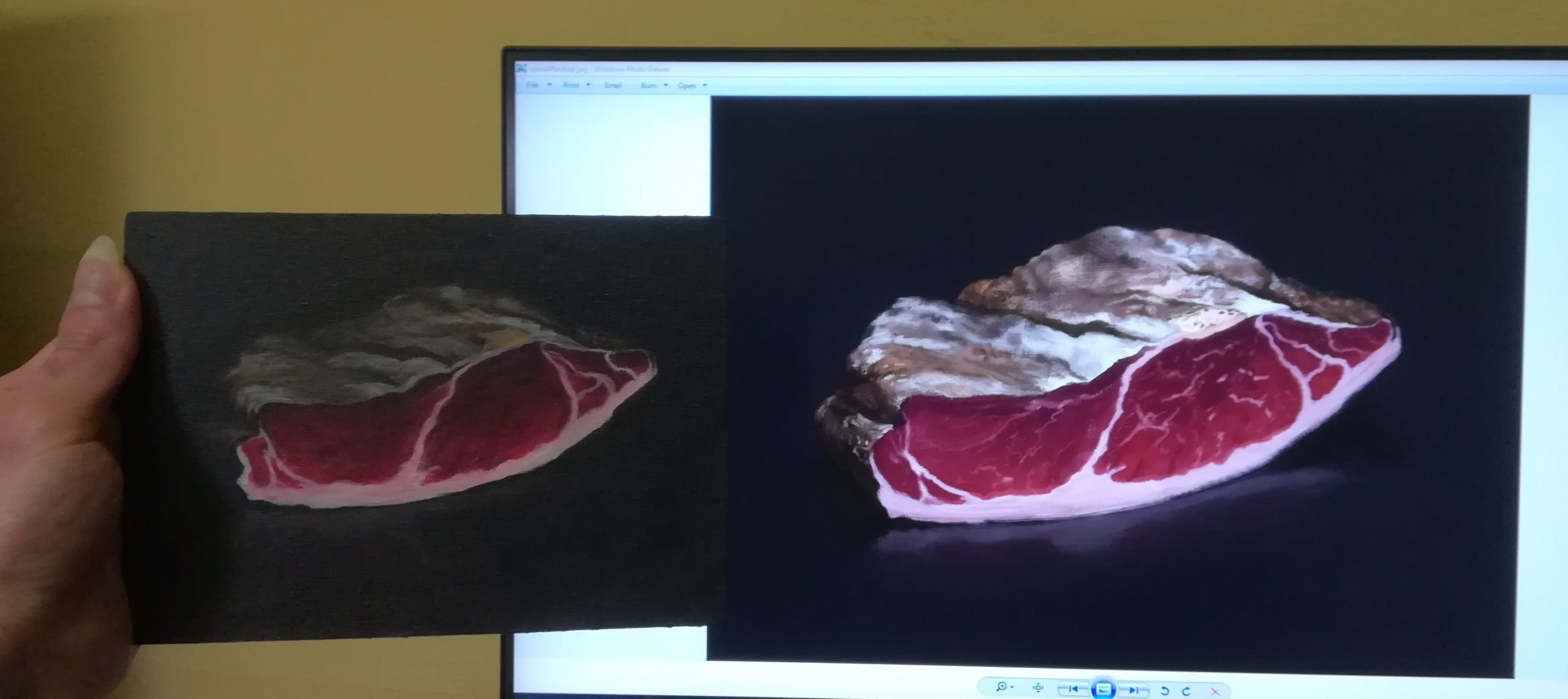
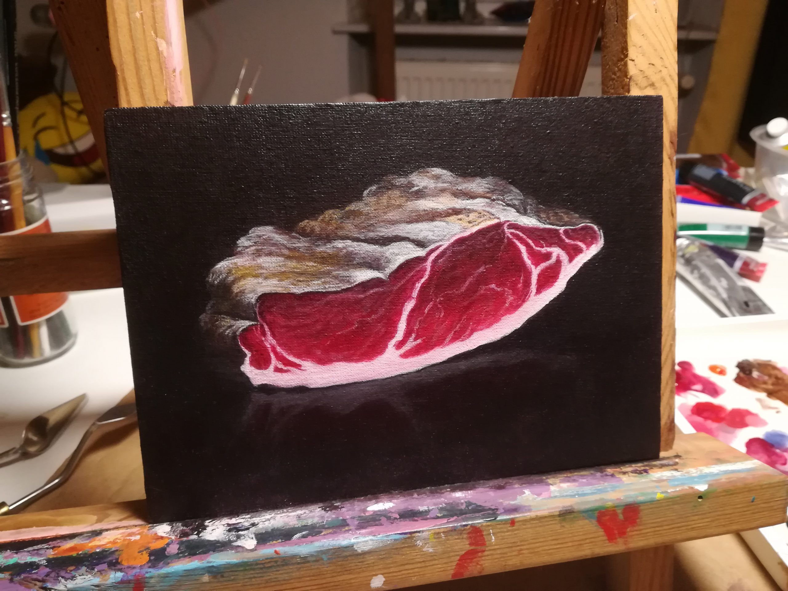
After loosely sticking to my digitally created reference painting, I went on to put in some extra detailing, despite it being a relatively small piece and featuring a pronounced cotton texture, which usually lends itself to hint at detail, but less so to actually paint in very specifically placed fine lines. I couldn’t help it though and in the end, those little bits added a final polish that clearly made it better.
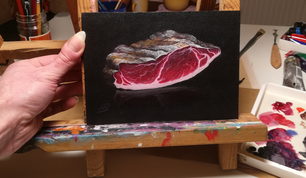
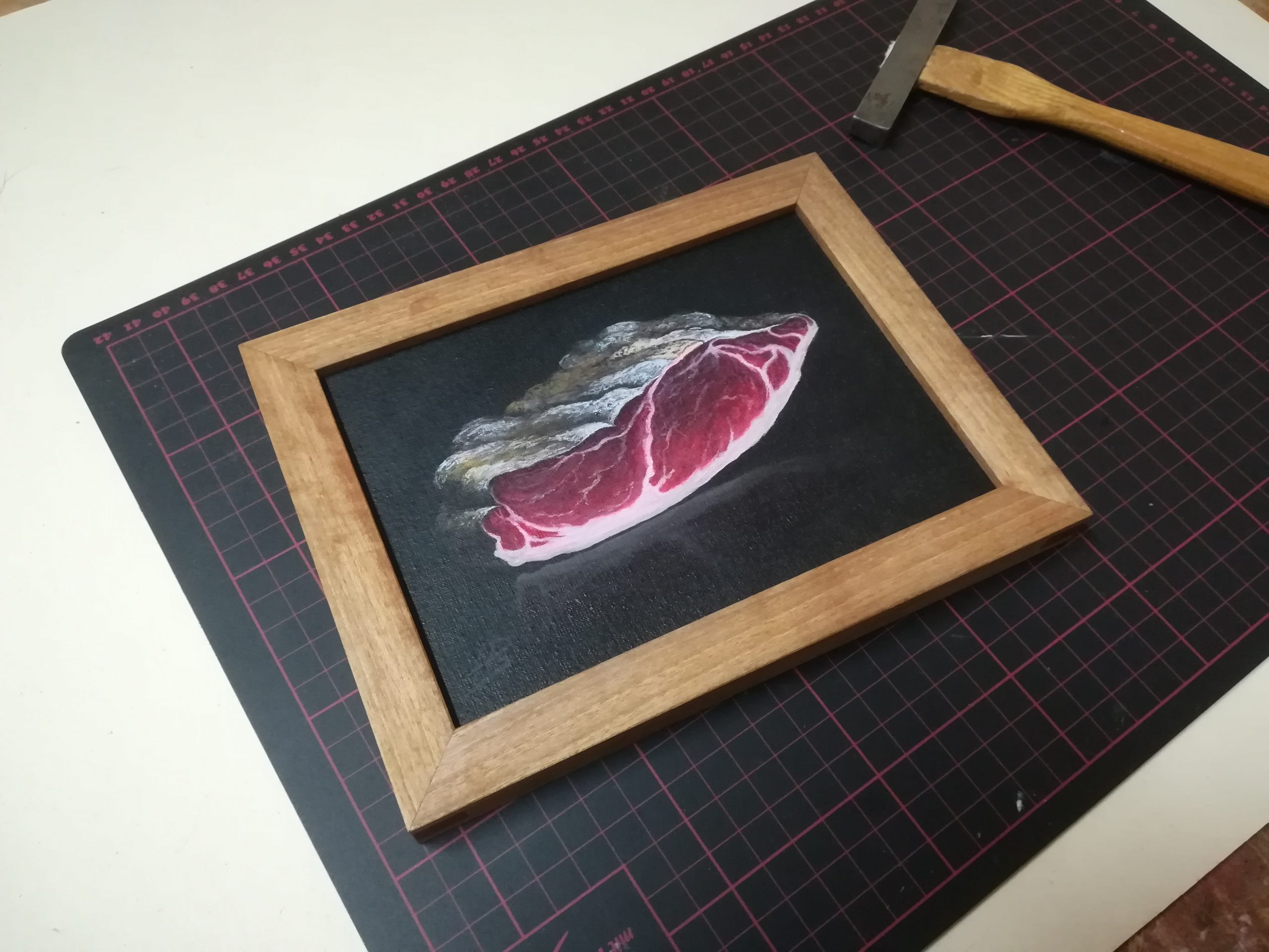
Another thing I couldn’t help was thinking about framing. There wasn’t enough time to make a new frame for it, but thankfully I did have an old frame around I made for another piece, which didn’t just have the right size, but the colour of the walnut also went well with the painting. Lucky!
The ham handed over and some distance to the creation process made this a good time to reflect. It’s unlikely to become a standard practice of mine, but in this case preparing with a preliminary painting didn’t just make for an excellent blog title and hopefully interesting read, it also supplied security when there was no time to mess up or deal with frustration.
Usually not someone who enjoys making the same thing twice, this time it was compelling and I even had fun doing it. A joy from start to finish, which I hope seeped into my painting just as spices permeate the Tyrolean Speck in the curing process.
If you enjoyed this article and would like me to write more of its kind, you can support and allow me to do just that over on ko-fi via that fancy floating “support me” button on the left.
Thank you,
Horst-Peter